Is Out-Of-Home Advertising Right for Restaurants?

Get out!
Betsey Griffin Jones, Media Director

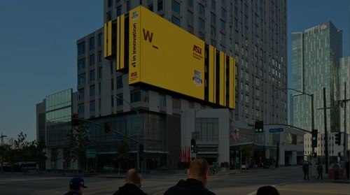
You’re driving down the road and suddenly your stomach tells you it’s hungry. Yep, time for lunch. Then you drive by a billboard promoting a nearby restaurant and, bingo, you’re there.

That’s the beauty of out-of-home (OOH) advertising. It’s visible, immediate, and you can’t turn it off. For restaurants, this tried-and-true marketing tactic has been proven to drive traffic, serving to remind and entice consumers. A recent Arbitron study found that nearly 4 in 10 (39%) people who viewed a billboard or another out-of-home media in the past month visited the store they saw advertised. The same study found that 40% of consumers report visiting an outdoor-advertised restaurant.*

Many businesses are tempted to abandon or cut back on traditional media, but it would be a mistake to do so, especially for restaurants that rely on foot traffic and late deciders. Other than television, out-of-home advertising might be a restaurant’s best friend.

Here’s what restaurants need to know about OOH marketing strategy.

More than billboards

There’s more to outside advertising than billboards. The Outdoor Advertising Association of America divides out-of-home advertising into four categories.

  • Billboards: bulletins, digital billboards, posters, junior posters and walls/spectaculars
  • Street Furniture: bus shelters, urban furniture (bus benches and newsstands), and digital urban furniture
  • Transit: airports, buses, subway and rail, mobile billboards, truckside, taxis/wrapped vehicles and digital transit
  • Place-Based: arenas and stadiums, cinemas, digital place-based video, interior place-based (convenience stores, health clubs and restaurants/bars), exterior place-based (airborne, marine and resorts/leisure), shopping malls and digital shopping malls

Brief is better

Many businesses—not only restaurants—are tempted to turn billboards into print advertisements. It’s important to remember that billboards are primarily meant to be seen, not necessarily read. A good rule of thumb is not to have more than six or seven words on an out-of-home message. Consumers can’t absorb your message if you try to jam too much into it. How long does it take to drive by a billboard? Your branding needs to be immediately identifiable and your message instantly understood.

Restaurants may only need a fantastic, enticing photo of something delicious and their logo. Maybe a clever headline to go with it. Consumers will see your advertisement for a brief moment. Make them hungry.

Do digital

Some businesses don’t appreciate outdoor digital advertisements, because the space may be shared by seven rotating companies. That will mean an ad is seen by fewer people than a static billboard. But it’s less expensive to contract a digital display. You’ll also save money by not having to produce expensive vinyl.

But alternating ads from multiple companies is also a benefit. Fluctuating ads attract more eyes than static billboards that remain unchanged for a long period—those can start to seem like wallpaper with passive messages. Truly, change is good.

Another benefit of digital is that they can be changed on the fly. You can display a new ad pretty much anytime you want. If one creative message doesn’t seem to work, then try something new. You can even have ready a variety of ads that are keyed to the weather. If the temperature soars, you can quickly enable your digital ad that tempts consumers with ice cream or a cold specialty drink.

Digital billboards can easily be programmed to aid a restaurant’s changing menu throughout the day—promote a lunch special until 2 p.m., then switch the message to one with a dinner enticement. Or change the board every day to advertise Taco Tuesdays or Friday Fish Feast.

Lost and found

Out-of-home advertising is also great for helping consumers locate your restaurant if it’s hidden. Some restaurants don’t need help being found—their buildings are in uncongested suburbs or rural areas, sometimes identified by a sign that can be easily seen from all directions.

But other restaurants find themselves on out-of-the-way streets or in busy urban centers, blocked by tall buildings. For those establishments, directional marketing might work well. You’ve seen billboards and bus shelters that say “turn here” or “just a mile ahead.” Without directional advertising, consumers might miss the restaurant entirely and end up eating at a competitor.

No billboards allowed

There are quite a few cites that don’t allow billboards in an attempt to beautify their communities. But don’t worry; there are other advertising avenues that can be just as effective, such as in-cinema advertisements shown prior to a movie. And there are several small but very effective outdoor tactics as well, such as the small signs on top of gas pumps.

Need help?

LAVIDGE has expertise in OOH media buying and developing creative for outdoor advertising. Our full-service advertising agency will work closely with the media team to create an out-of-house media marketing and advertising strategy perfect for driving more customers to your restaurant.

To learn more, give us a call at 480.998.2600 or send email to [email protected].


10 steps to a great billboard ad 

Paul Suggett at The Balance has some great advice about building a better billboard advertisement.**

  1. Six words or less is ideal. Six seconds has been touted as the industry average for reading a billboard.

  2. Get noticed, but don’t be a huge distraction. Don’t be responsible for an accident.

  3. This is not the place for direct response. Billboards are best for brand building and supporting a campaign, but not ideal for heavy lifting.

  4. Be smart, but not too clever. A smart billboard will grab the attention and leave a lasting impression. But one that tries to be too clever may get lost on the audience.

  5. The more billboards, the better. Billboards are a mass-market medium, but they need support. You want more than one, and you want as many eyes on them as possible.

  6. Don’t say it, show it. Get creative. Billboards can go 3D and include moving parts.

  7. Avoid repetition of any kind. If you are using a headline that explains your visual, you’re wasting words.

  8. Keep it simple. The billboard is a punch in the face. The simpler it is, the more powerful that punch.

  9. Be wary of logo size. If your logo is too big, it may distract from the message. Too small, and it’s a clever ad for a brand no one connects with.

  10. Do the “arm’s length” test. Print your billboard to the size of a business card and hold it at arm’s length. This will simulate what consumers will see.

*: Arbitron Out-of-Home Advertising Study
**: The Balance, “10 Steps to Making a Great Billboard Ad”

2017 Southwest Food Service Marketing Report


Marketing Report Brochure

This article is a brief abstract of our exclusive and authoritative study that takes the guesswork out of food service advertising and marketing. Rather than speculating about what will drive consumers to action, we've asked them.

LAVIDGE Form Title
*all fields are required

Sign up for our LAVY email

and get our bi-monthly newsletter.